 Recruitment Websites
Build high-converting recruitment websites supercharged with intelligence
Transform your recruitment agency's digital presence with our award-winning conversion-optimised website software. Drive 180% more traffic and 80% higher conversions with recruitment-specific features that your competitors don't have.

Recruitment website technology trusted by 750+ agencies around the world
Market-leading recruitment agency website design
Access Attract Evo (formerly Volcanic) brings together high-converting career sites with AI-powered recruitment intelligence that monitors performance 24/7, alerts you to failing campaigns within 48 hours, and provides simple, actionable next steps.
With our recruitment marketing platform, you’ll get:
- Design Studio
- Copilot Intelligence
- Conversion Intelligence
- 48-Hour Smart Alerts
- Mobile Gap Insights
- Keyword Search Feed
Our Recruitment Website Platform
+
Access Attract Evo powered recruitment website created
%
Increase in job applications
%
More website conversions
Key features of our recruitment website platform

Copilot Intelligence
Ask questions like “Which sources convert best?” or “Why did applications crash?” and get clear, plain-English insights in seconds.

Conversion Intelligence
See why conversion rates vary, what to fix, and the revenue impact of optimisation. Includes Keyword Gaps, Mobile Engagement Drop-off, and other conversion killers.

48-Hour Smart Alerts
Zero-application alerts, UTM source spikes/dips, and issue flags that surface problems within 48 hours, not month-end.

Real-Time Performance Monitoring
Automatically detect broken forms, dead links, and other technical issues before candidates hit them, keeping your site error-free 24/7.

Design Studio (No-Code Builder)
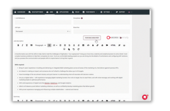
Drag-and-drop editor plus SmartBuilderAI for AI-generated layouts and content suggestions based on real conversion data.

Psychology-Backed Templates
Job pages, CTAs, and content blocks validated through behavioural science and real candidate testing, maximising engagement on every page.
Upgrade your recruitment website to grow your agency
Built with recruitment marketers in mind
Our recruitment agency specific CMS is tailor-made for marketers, making it easy to manage jobs, events, blogs, testimonials, and more.
- Prevent £2K–£5K monthly waste with 48-hour campaign warnings
- Prove ROI instantly with campaign-to-placement attribution
- Save 8–13 hours monthly with instant, plain-English insights answers
- Boost performance by 35% through AI-powered proactive optimisation

Connect and convert candidates faster with Access Attract Evo
Connect and convert candidates faster with Access Attract Evo
Access Attract Evo goes beyond a beautiful career site. It gives you the intelligence to connect with candidates faster and convert them into hires more efficiently.
- Frictionless candidate experience
- Personalised job recommendations
- Smart integrations for maximum efficiency
- Conversion intelligence built in
- Lead the way in digital candidate journeys

Recruitment websites FAQs
What is a recruitment website?
A recruitment website enables a recruitment agency to advertise its open roles and encourages job seekers to apply.
A good recruitment website also helps the staffing business to build its brand and engages the hiring organisations with helpful blogs and case studies demonstrating previous success.
Being efficient is high on the agenda of recruiters, too. A recruitment website should integrate with CRM and other back-office technology to make it easier to accept and process candidate applications. Your website is a key asset in your recruitment technology stack.
A recruitment website should be accessible and usable. When designed right, your website should deliver a barrier-free user experience that all visitors can access and engage with.
How much does a recruitment website build cost?
The cost of building your recruitment agency website varies significantly depending on several factors. A basic template with limited functionality can start from around £300, however these come with hidden add-ons and features that your agency will likely need. A more complex website with advanced features, integrations, and customisation according to your brand will require a bespoke price.
What do I need to get started?
To get started with building your recruitment agency website on a platform like Access Attract Evo, you’ll need: branding assets, content for your site, job listings, specific technical requirements, and some goals highlighting what you want to achieve with the site.
Everything your agency needs to win
From software products designed to solve key challenges to a fully integrated solution:
- Providing your recruiters with tools to drive revenue
- Supplying your management with necessary reporting
- Reducing operating costs by building efficient and scalable middle and back-office teams
- Enhancing the digital experience for applicants, workers, and clients
Discover how Access can help your entire recruitment business become more productive and efficient, giving you the freedom to focus on clients and candidates.

 AU & NZ
 SG
SG
 MY
MY
 US
US
 IE
IE


